Beatrixe Font + Graphic Pack
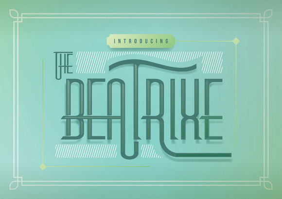
Beatrixe is a font inspired by vintage lettering. Small-caps version. Always fit for your poster quote things, logo, branding, magazine headlines, sign, etc.
Beatrixe is a font inspired by vintage lettering. Small-caps version. Always fit for your poster quote things, logo, branding, magazine headlines, sign, etc.

Ovsyanka (oatmeal) is the new mark with rounded corners and the effect of wear letters. Font is ideal for packaging various products, for the design of boxes of chocolate or coffee packets, for all that can be tasty and healthy.
This Geometric Sans is noted for it’s embolded letter weight and characteristic slants. It’s appearance is commanding on a front page or cover but won’t dominate with it’s simplistic design. OTF features like stylistic sets, ligatures, alternates, ordinals, and fractions are included.
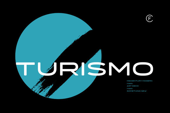
Inspired by midcentury motorsports, technology, and business, Turismo CF is designed for stunning logotypes and gripping headlines. Taking cues from both the 1960s and 1920s, Turismo combines strong rectangular shapes with sloping, elongated curves.

La Mona Pro ( 2015-2016) Concept: La Mona Pro , Mona is a redesign of the 2012 design .. Greek is case sensitive, as also in Cyrillic, it contains ligatures, ornaments, layers, shadows, swash alternatives, the Mona typography Pro is designed with more variants Chile (72 fonts) .. Play!

Furius is a display typeface inspired by the split serif style of woodcut or chiseled letters found in roman inscriptions and later popularized by the western genre in the United States. Created as a display typeface, Furius combines a host of Opentype features and equally incoporates a full extended latin and cyrillic character set to provide a versatile and complete design solution.
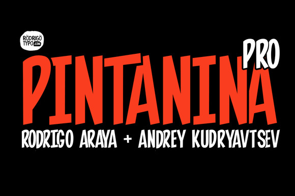
Name: Pintanina Pro Year: 2015 Author: Rodrigo Araya + Andrey Kudryavtsev Concept: It is redesigning pintanina 2013, now improved certain details, and contains much more ligatures, always inspired by the great Latin American comic as Condorito, high and thin typeface
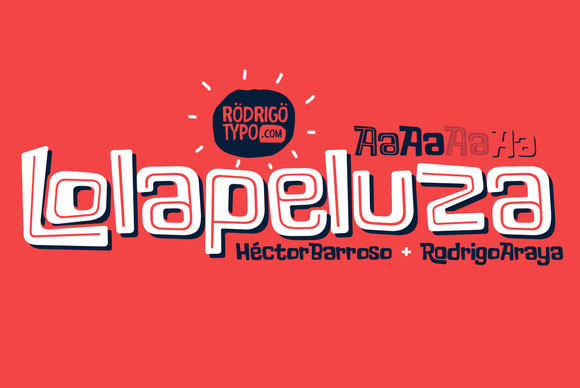
Name: Lolapeluza Family Year: 2015 Author: Héctor Barroso Concept: Inspired logo “Lollapalooza” The intention was to design a typeface cheerful, Entertaining, it worked perfect Designs for children and youth 4 variants are also included: -Regular: Basic set -Black: Heavy -line: Can run over or behind text -Shadow Cyrillic alphabet is also included to enhance but the typography more a set of alternative.