
Responsive WordPress Theme – Maximum theme is suitable for multipurpose website that your want to build on WordPress platform.
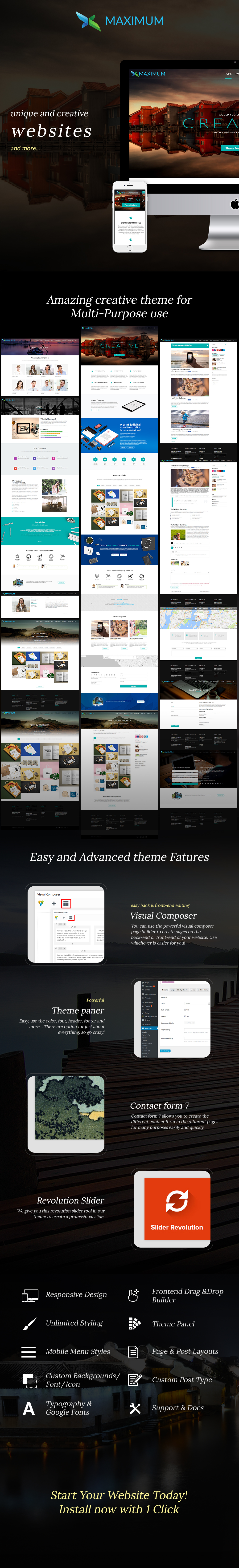
The Maximum theme gives a greater number of features than any other themes out there. Its coding is done in a way that it looks extremely efficient and un-bloated. Also, any feature you would prefer not to use you can directly disable it from the built-in theme panel or a custom child theme function. But having so many features doesn’t make it difficult to use. In fact, it is very easy to use, when you begin with using the Maximum theme you will definitely love it and not going to use any other theme.
The Maximum theme includes a lot of Theme Panel settings (but it’s been coded in a way that loads quickly and includes only the key settings for you to tweak your theme to best match your needs). And all the settings are neatly organized into various tabs with icons for easy usage. It should be easily to go down the list of options as you setup your site each section at a time. Also if you Enable or Disable your Portfolio or Testimonial post type via Custom Post Type options in Panel.
Maximum Theme gives features true unlimited styling. We’ve extended the popular WordPress customize to include tons of color pickers, font options, margins & paddings and more. Plus, Maximum features custom design options for many of the Visual Composer page elements, so you can customize colors, borders, animations, heading and so much more!
Maximum comes with various page and post settings to help you tweak things on a per-page or per-post basis. On every post and page you’ll see a Page Settings section (it can be disabled though if you want to) that includes but isn’t limited to the following options:
Choose your Header Style Normal or overlay for particular Pages.
You can choose to enable or disable your page title.
Title Style Options Such as Title Background Image, Title Background Color & Title Height.
You can choose to enable or disable your page Breadcrumb.
Page Style options such as Page Background Image & Page Background Color.
Use any color, image or pattern you want for your backgrounds! It’s easy. Simply use the options in the Page Settings under the background for color and/or upload a background image.
You can also set a global website background from the customizer. Go to Maximum > General Theme Options > Site Background to choose a color, image that will be used on every page of your website.
And with the Visual Composer page builder you can also add custom backgrounds to your rows. So wherever you want a background, you can have it!
Custom title backgrounds are easy to add with Maximum built-in Page Settings. On any post or page, you can add a custom title background by color or by uploading an image. You can also choose a custom Title background height to make your site look one of a kind!
You can Enable or Disable Custom post Type in Maximum theme.
Go to Maximum > Custom Post Type (CPT), From that you can Enable or Disable Testimonial or Portfolio
Maximum includes the Visual Composer plugin for a low price of Free!.It means when you purchase Maximum you will also receive the zipped up Visual Composer plugin ready to install right in your dashboard.
Front-end Editing
The Visual Composer will allow you to easily create your website via a front-end drag & drop editor so you can see exactly what your site is going to look like as you create it! This makes it easy to work with for beginners and advanced users alike.
Maximum Theme has various styles for the actual menu buttons but also for the mobile menu itself.
Choosing a page layout is easy with Maximum easy options. We’ve built-in options for selecting a full-width, no sidebar, left or right sidebar layout. And it’s as easy as selecting a layout from a drop down.
Select Your Layout
There are global page layout options under Maximum > General Theme Options > Pages Tab where you can choose your own default page layout.
Maximum Theme is fully responsive. The Maximum theme adjusts to fit the size of your browser. Maximum looks great on computers, tablets and phones!
Theme Responsive Settings
You can edit your Theme Responsive sizes manually from the Theme Panel. In the customizer, under layouts, you’ll find options for change or set pixel or percentage width for desktops, mobile and more.
Revolution Slider, you can create elegant websites to really impress your readers. Create sliders and add it to to any post or page using the Visual Composer slider element, by adding the slider shortcode to the page.Installing plugin at a time of theme install.
Slider Features
There are tons of options included, and more are added with every update. Here are just a few of the awesome things that Slider Revolution can do:
- Responsive Sliders
- Add Text, Images, Video & Shortcodes
- Custom Styles, Animations & Transitions
- 3D Parallax Layers & Backgrounds
- Custom Google Fonts
- WooCommerce Support
- Design Custom Navigation Sets
- Built-in Color Pickers
- Easy Slide Element Timing
- Custom Slides For Different Devices
- Fallback Mobile Options
- Intelligent Lazy Loading
- SEO Optimized
- And Lots More!
Maximum includes incredible typography options to help you create a one of a kind website in no time. There are over lots of Google fonts, letter spacing, font weight, font size, font color, line height and more built into the theme and available via the theme panel. Plus, tons of Visual Composer elements include custom typography options too!