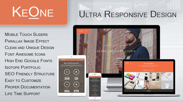
Why KeOne is Ultra Responsive? Because not only the design is responsive, but also the images are responsive. For example, an image from carousel loaded on laptop will have a size of 1024x800px and ~200KB, but on mobile will have a size of only 480x320px and ~30KB.
62% of the weight of the web represent images, and the trend is to add more images every day.
That’s why a responsive image is the solution for an optimal viewing experience on mobile / tablet and other devices.

Full Features
- Ultra Responsive Design / Images
- Parallax Images Effect
- Unlimited Color Style
- Made for Mobile first, with Touch Events
- Best Plugin (Aqua Page Builder – KeOne) for One Page Themes with 12 customizable blocks
- Isotope Portfolio
- Single Project Details
- Bootstrap 3.2
- Font Awesome
- Clean and Unique Design
- Easy to Customize
- SEO Friendly Structure & Coding
- Contact Form 7 plugin integrated
- Google Map integration
- Proper Documentation
- FREE Support